ROLE
Sr. Product Designer
TOOLS
Figma, Jira, Adobe Suite, Blender, Whimsical, AI
OVERVIEW
Responsible for crafting experiences that engage and make company’s B2B app more efficient, engaging, and robust with features. Heavy auditing, designing across breakpoints, prototyping (Figma/After Effects), and iteration of new, next-gen releases/features.
PROJECTS
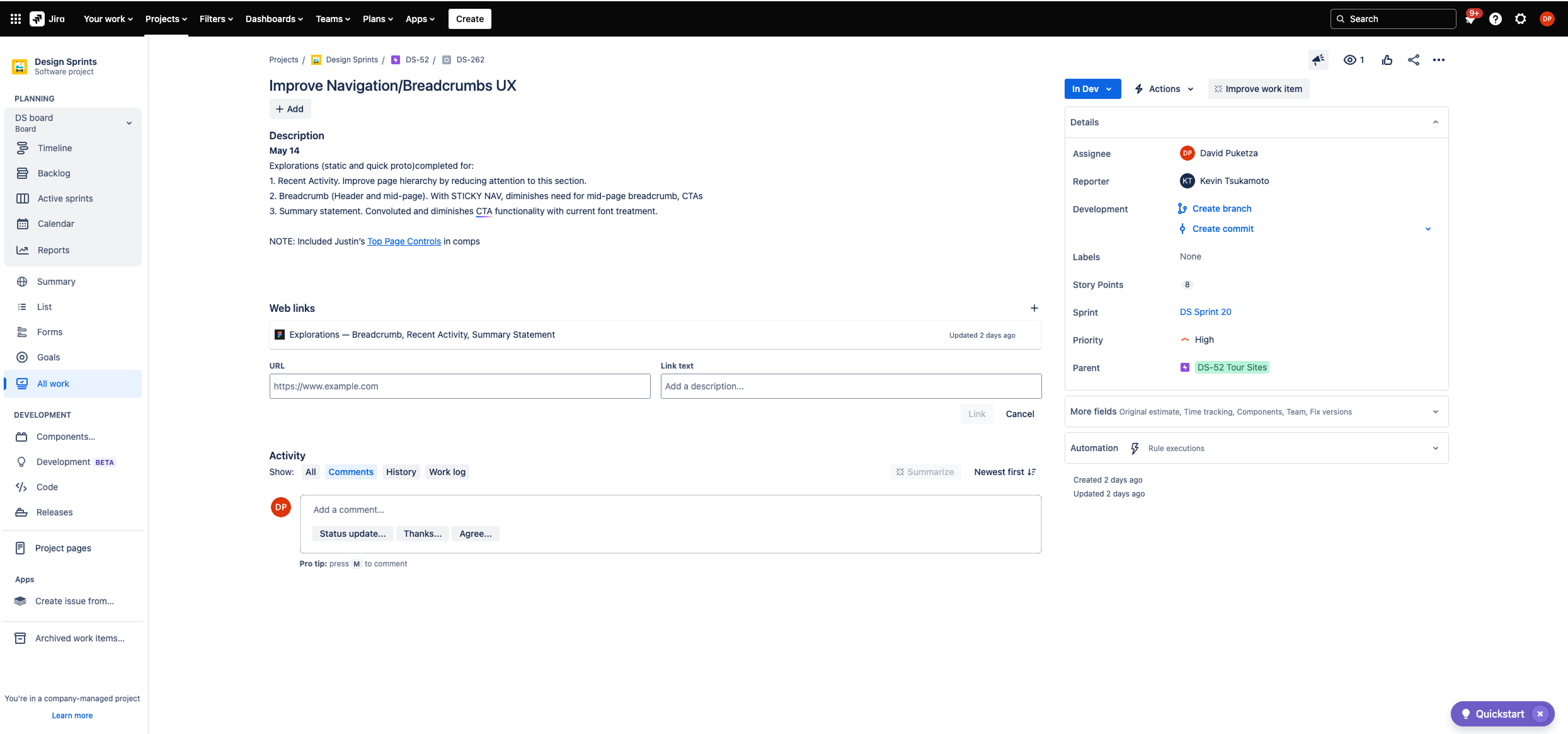
JIRA 262 — Improve breadcrumb experience / Recent Activity
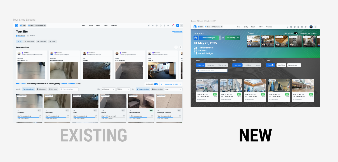
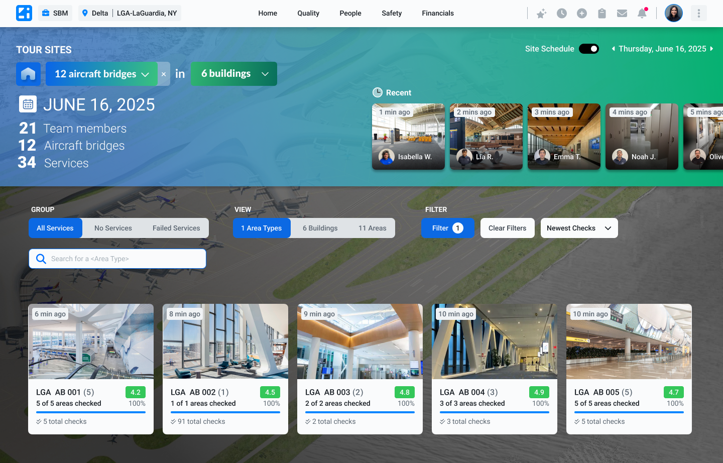
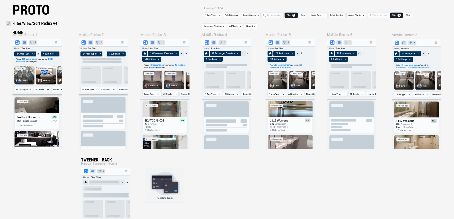
Explorations led to creation of new component: dynamic bread crumb with populated data and search capabilities giving user more agility to access targeted information with “Tour Sites”— a feature of the tool that gives client access to building audits, schedule history, photos, employee actions. In addition, complete visual overhaul to bring better hierarchy to attributes and aesthetic lift. Recent activity (NOT the focus) given a more appropriate placement and layout. Story points system used. Assessment: 5-6
Alt layout. My background in architecture still a big part of my design acumen, I felt it necessary to introduce imagery that both gave some context orientation and another visually enriching layer to the pages. Client: Delta Airlines. LaGuardia Airport.
Motion design (aka kinetic flourish)—crafted lean, nuanced animations to elevate the visual UX, giving a pulse and vibrancy to an otherwise static page. After Effects/ Figma
Mobile prototype: Dynamic breadcrumb/ recent activity redesign
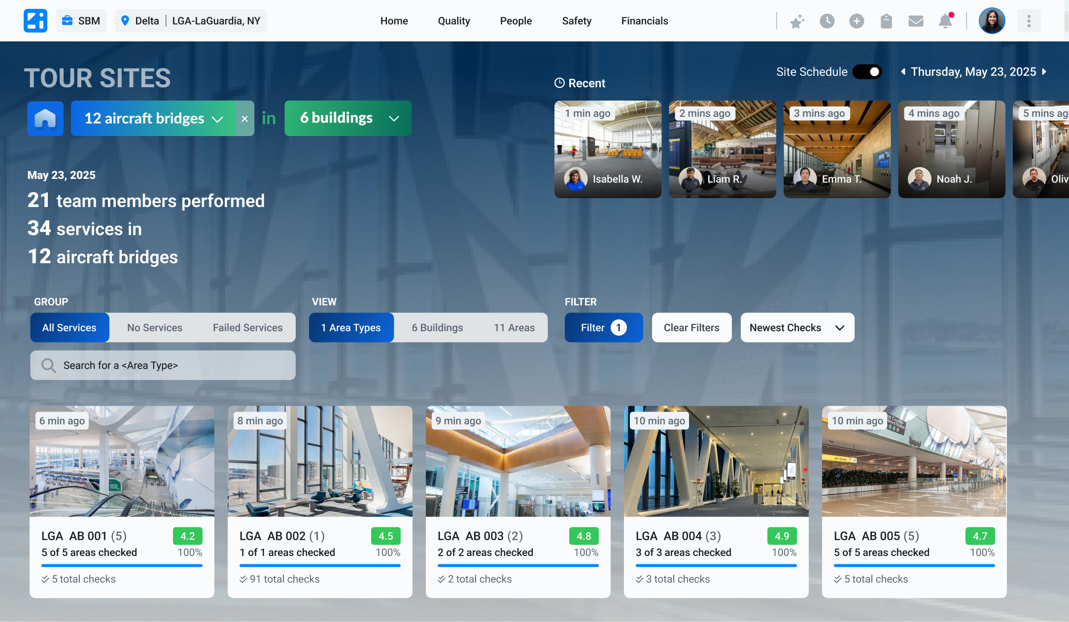
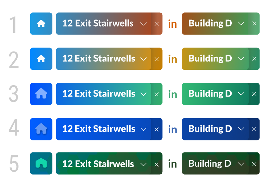
Color studies for breadcrumb. Gradients expanding across shapes for visual cohesion.
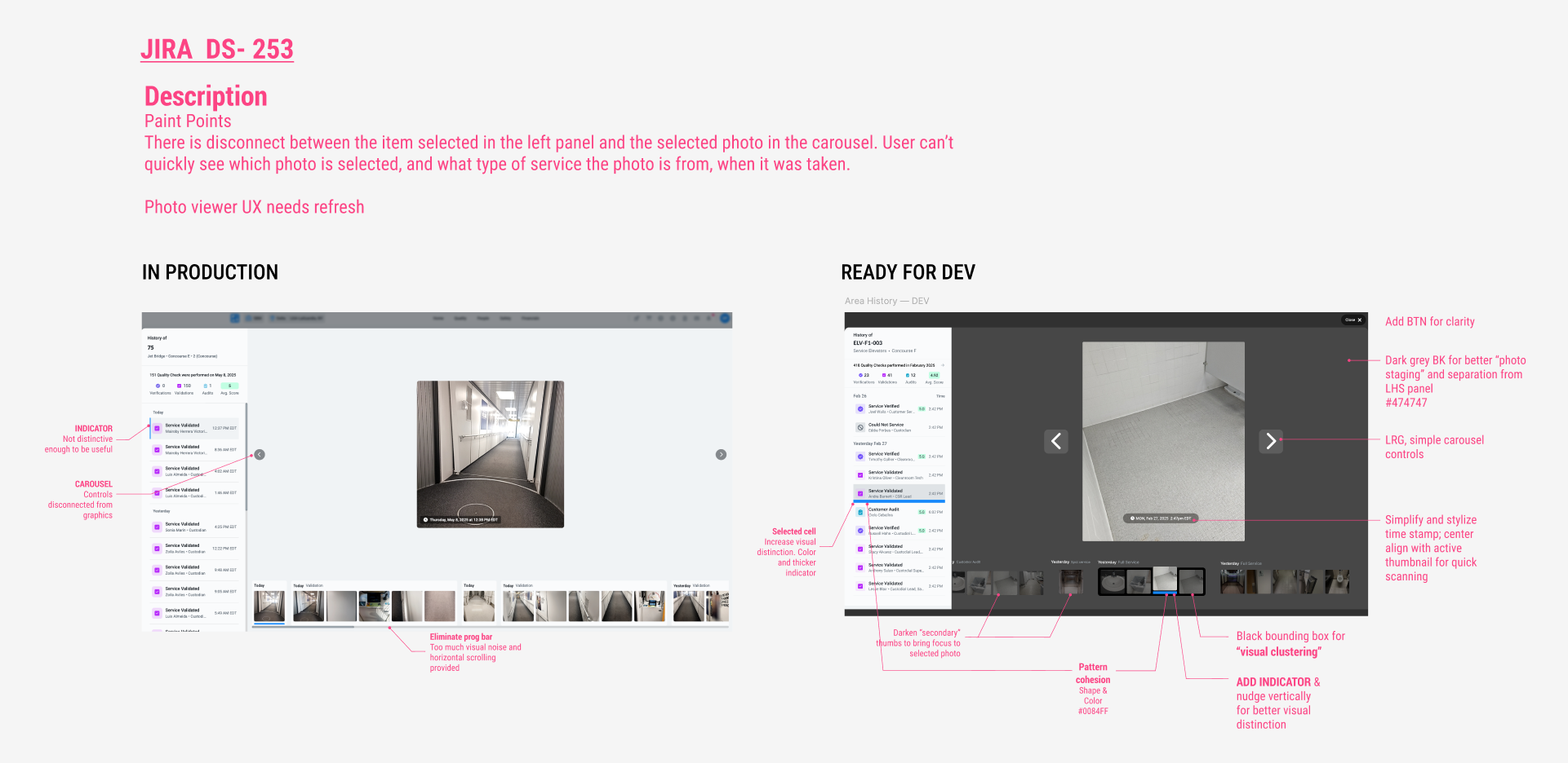
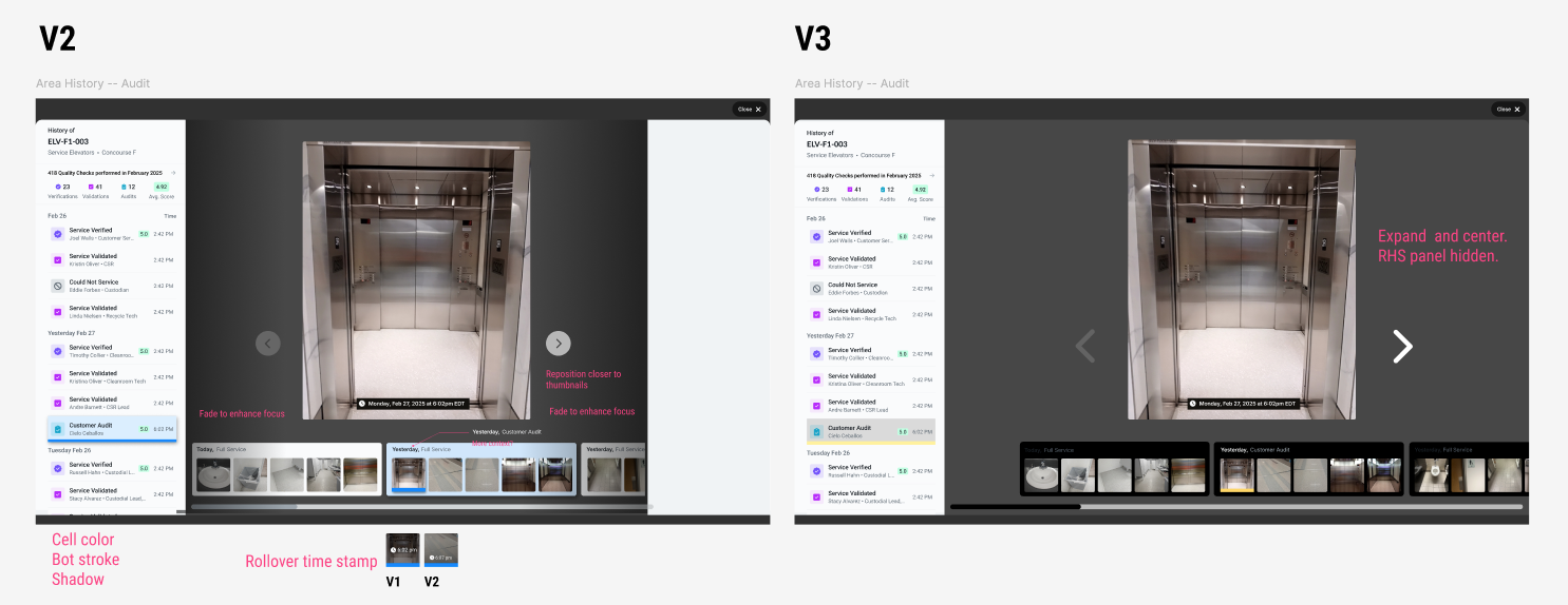
Improving service photo browser UX
Another typical Jira ticket. Used visual heuristics and Jakob’s Law (familiar universal patterns/layouts) to arrive at a few versions. Those were socialized with valuable feedback folded into another round before final upvoting and tagging for DEV READY. Story points system used. Assessment: 3
Other concepts exploring new patterns and visual looks.
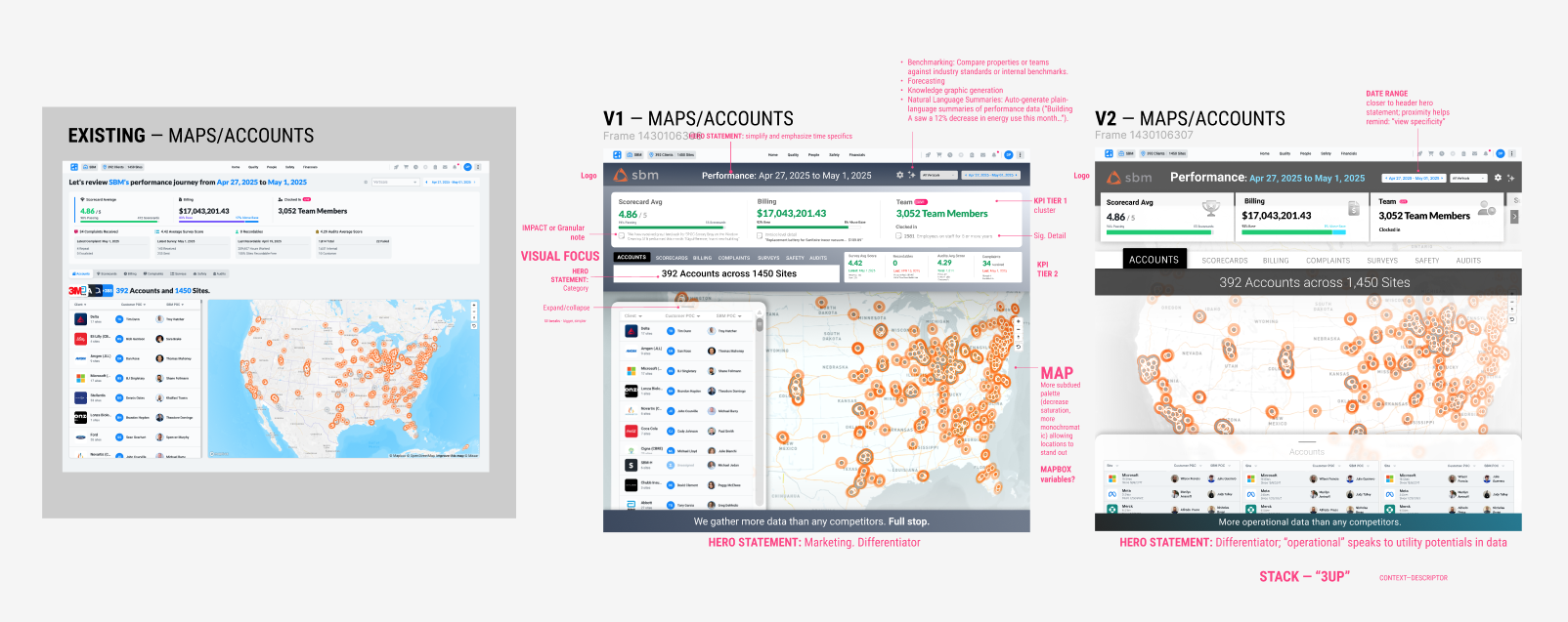
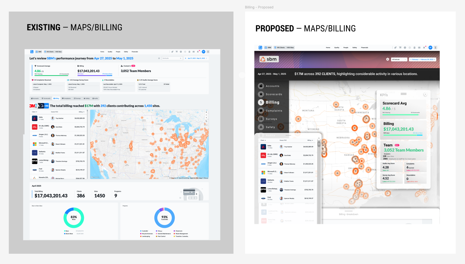
Improving Map UX
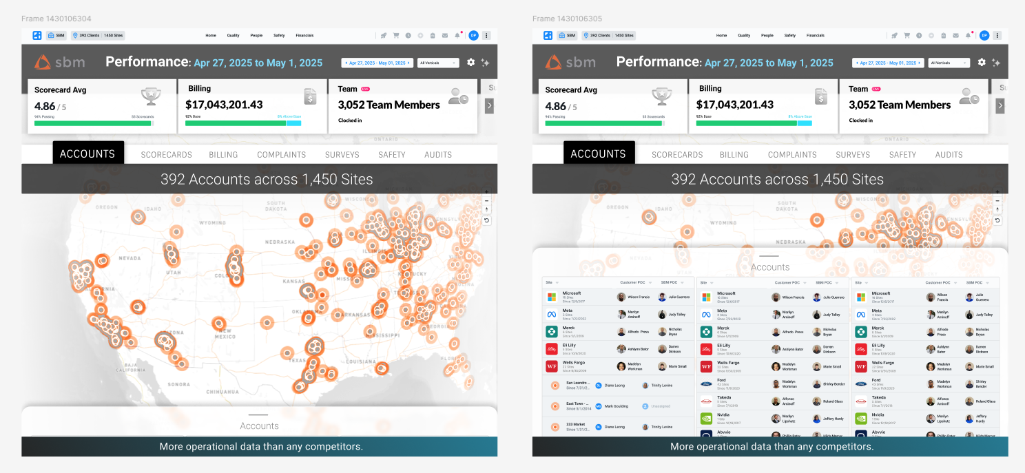
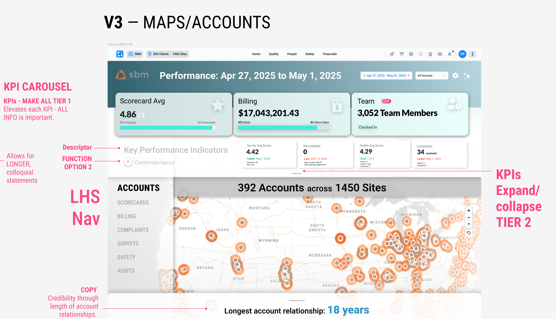
Instrumental in arriving at design decisions was audit of current UX/UI, informal research with PMs close to clients who interacted with tool, and survey of other effective map utilities. From that, I arrived at new patterns and layouts and visual strategies that would help unlock the potentials and information that were diminished in current design. Design priorities:
Improve visual hierarchy
build functionality in panels for improved user control
simplify information design
refine map (palette, layout)
Finesse background and layering for improved scannability of elements
Abbreviate narrative statements into digestible specifics
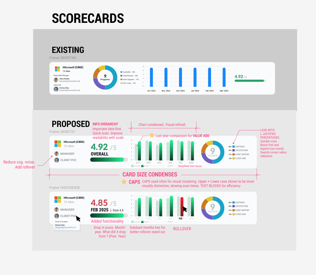
Service scorecard refresh.
Jira ticket — Scorecards refresh. Pain point: difficult to scan quickly and short on valuable information. Aside from large VISD changes to help reduce cognitive noise, simplify, and improve scannability I introduced data comparison as a VALUE ADD.
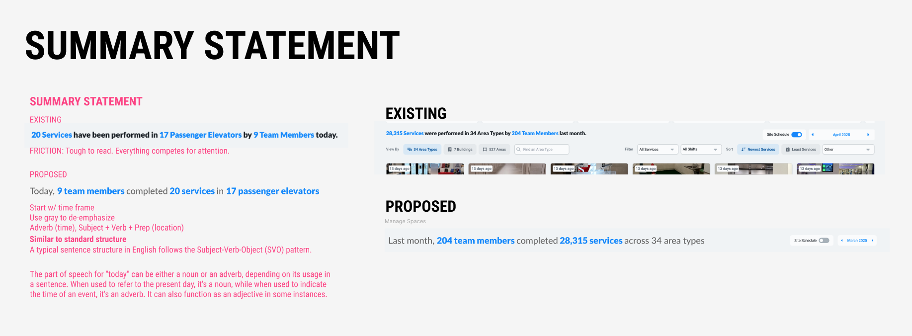
IMPROVE SEMANTICS
PROBLEM: Tool hampered by convoluted
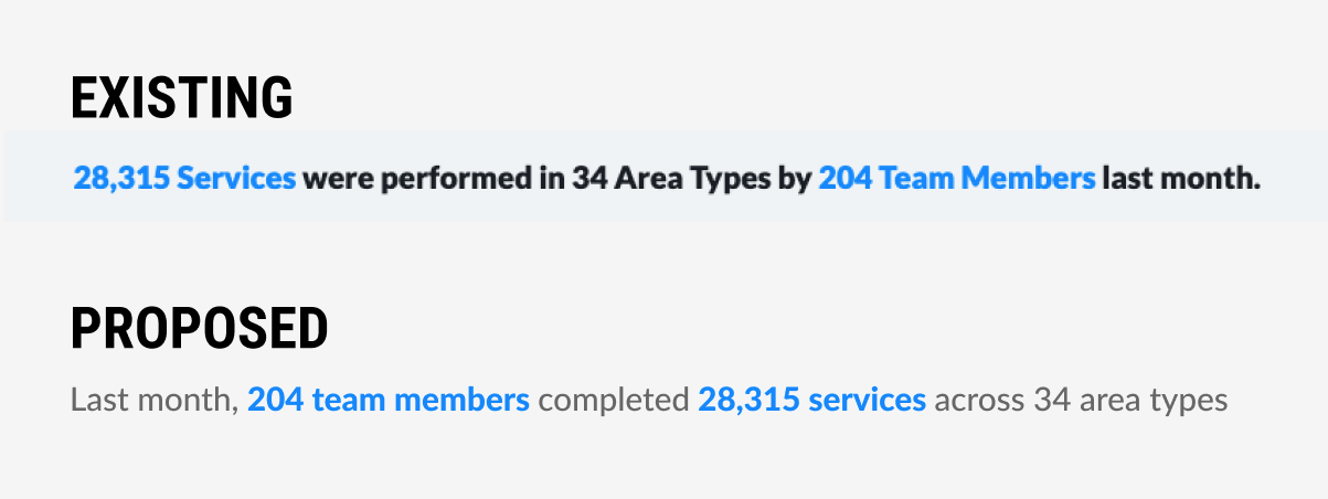
“summary statements”, crucial “quick reads” of performance in a given time period. Summaries were difficult to read/digest because of structure and layout.
SOLUTION: use standard sentence structure:
SUBJECT + VERB + OBJECT. Better treatment to emphasize data points and text CTAs


