
Work listed chronologically (generally)
DonorsChoose.org

A non-profit with tremendous mission: get resources into classrooms that need them. They do it through crowd-funding—Citizen philanthropy. They are UNSTOPPABLE. For 6 years I acted as head of UX/UI & Creative in general. Some people called me “Art Dept.” We didn’t really have titles. What we did have was that crucial mission that required communicating the delight of teachers and students getting much-needed materials along with the gravity of many classroom situations.
Mobile breakpoints home, footer, project page
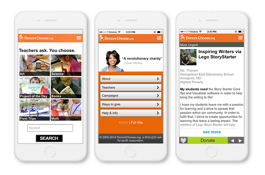
Iteration of HP, ever-evolving based on metrics, testing, stakeholder input. Design goals:
Quick access to projects, isolated out by themes/functions
Heavy on endorsements from key evangelizers (Oprah and Stephen Colbert)
Prominent CTA for teachers to get them in flow for creating a project
Impact numbers to demonstrate effectiveness
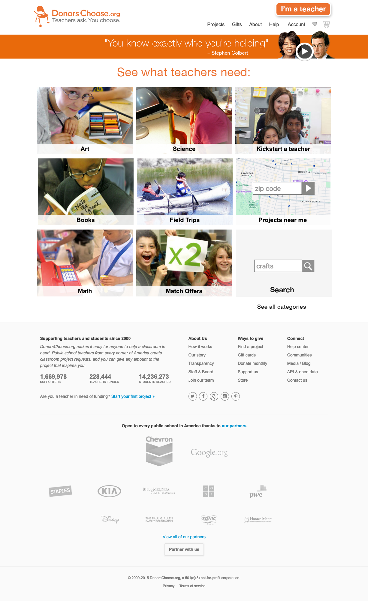
Site module—Input page reflecting partnership (in this case Warby Parker) campaign active for a limited time. Leveraging actual classroom photos for use in designs
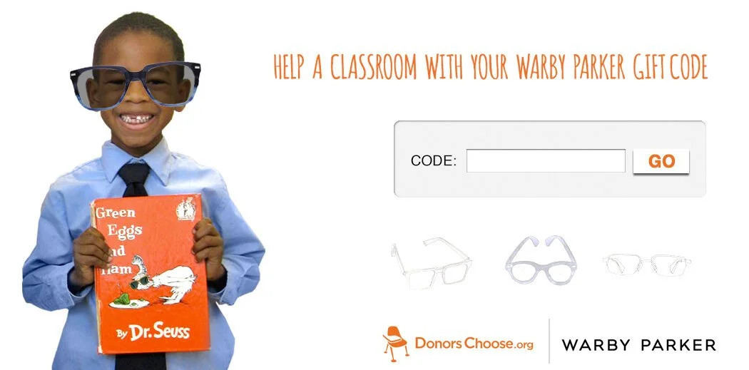
Early version of a project module with inline classroom “Thank You Photos”, featuring the resources or experiences made possible by donations as well as thank you letter from the teachers themselves, “closing the loop” on the giving experience. UI functionality: displays the project as a bus journey, with active tab communicating current state of project. Bus metaphor seemed apropos given the educational bent of this platform/experience.
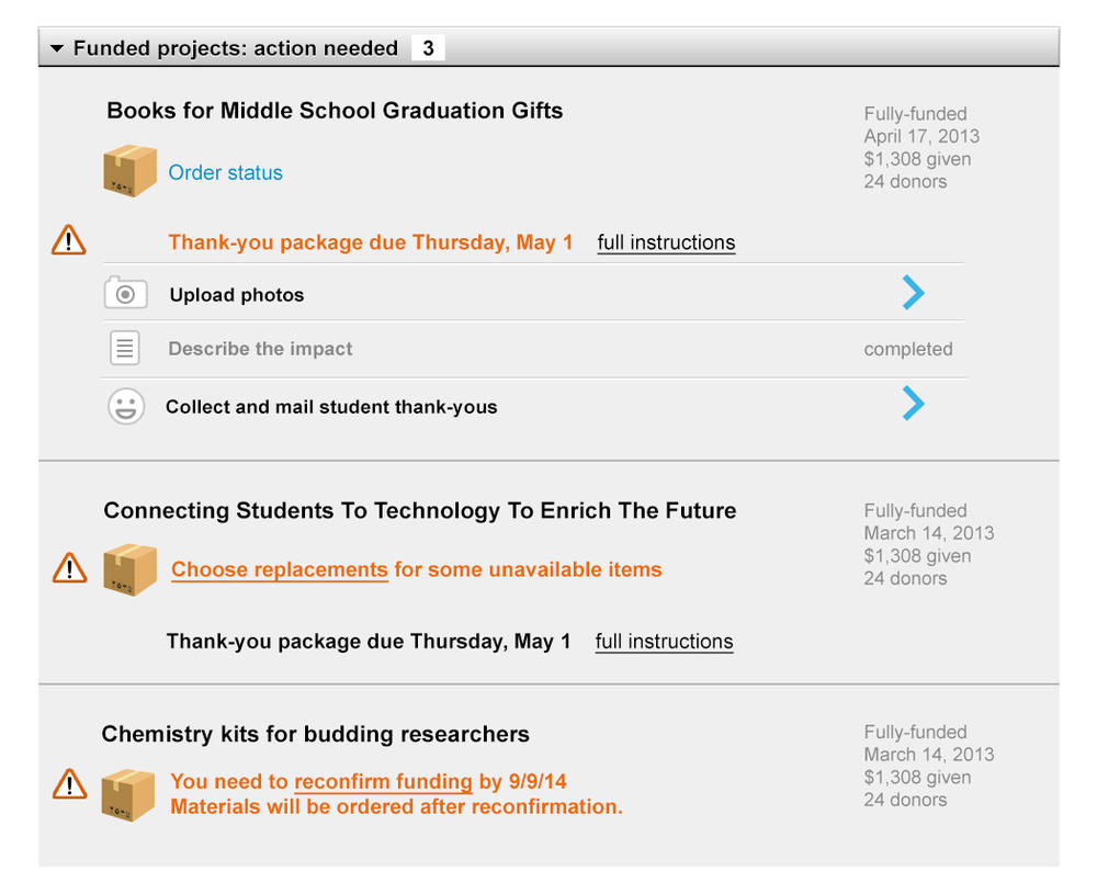
Back-end tools - Teacher Page
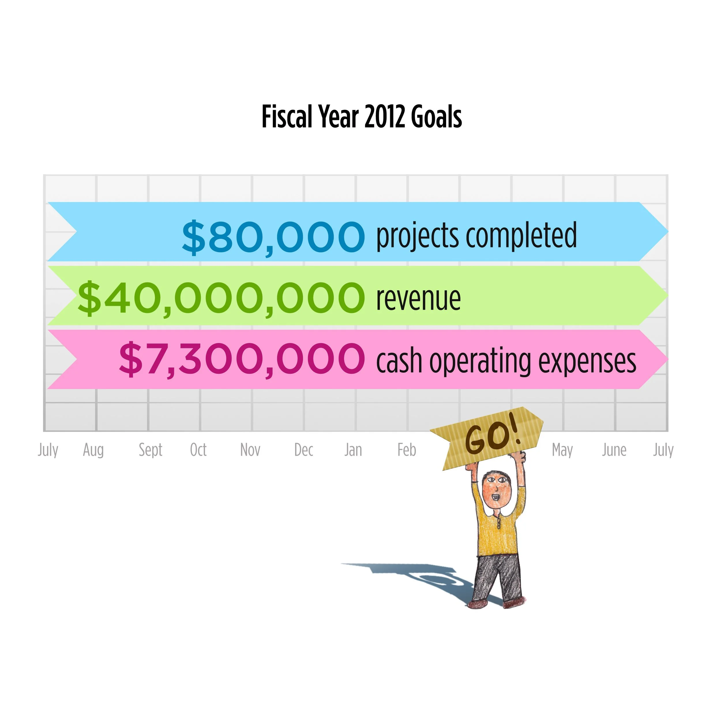
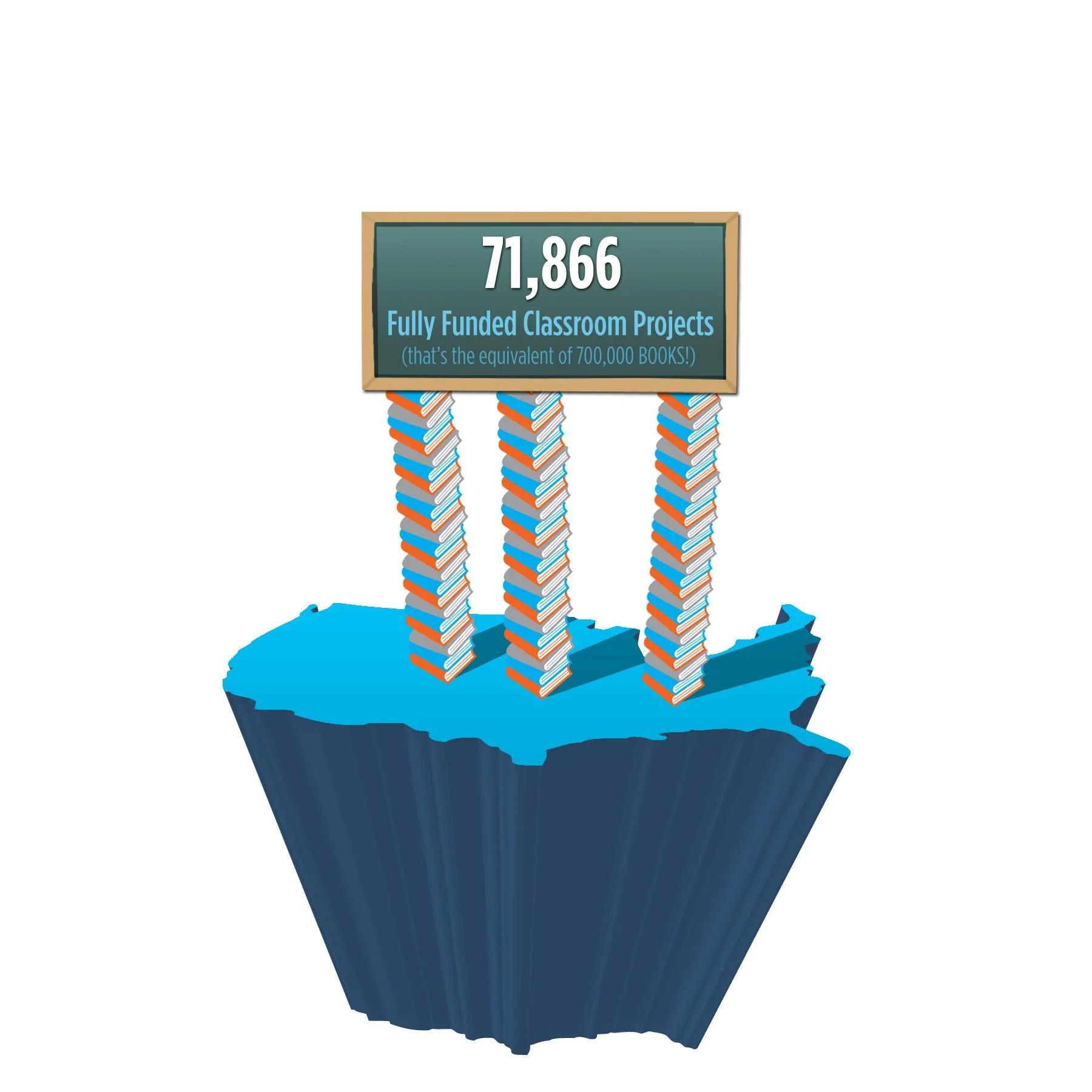
Designed a lot of financial decks, wrapping up each year’s impact and goals for the fiscal quarters/years ahead
Branding—logo relaunch. We needed a visual shorthand for “classroom/students” that was friendly. Enter, the Eames student desk chair. I shortened legs and enlarged footpads to communicate youth and to give it more character as a mark. Palette shift as well for more energy. Before and after. Tagline was upvoted after several rounds of meetings and input from teachers.

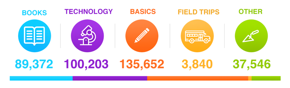
Data visualization of the project varieties living on the site for to better inform potential donors of where help is needed
Designed a lot of company swag — graphics and copy. Mindy Kaling, kind enough to be a booster and swag promoter.


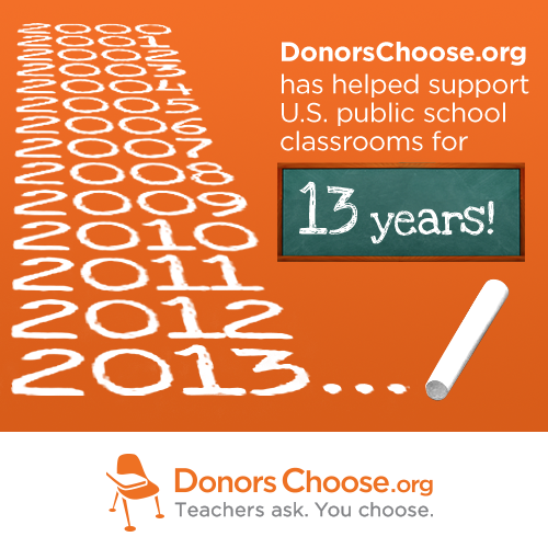
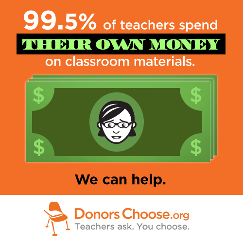
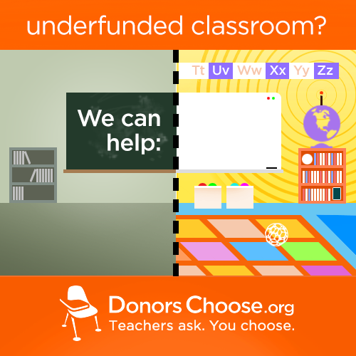
We called these “shareables” — used for various mission-oriented activities and designed to be shared by donors and teachers to evangelize the platform.

Fundraising campaign graphics
Again, repurposing student artwork in constructing digital assets for the site.
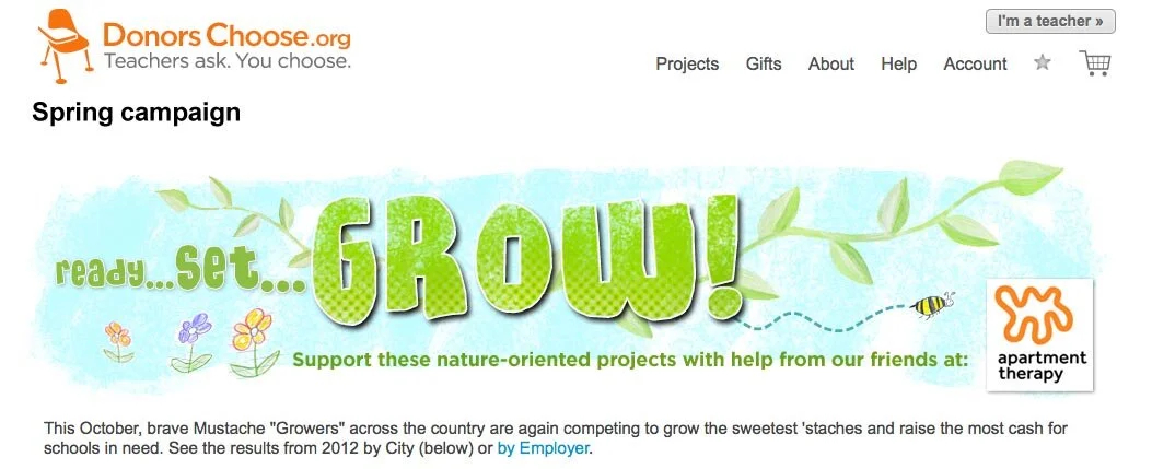
Every November was “growing season.” We hosted a very successful fundraising campaign—MUSTACHES FOR KIDS– complete with leaderboards and grew really unflattering staches. One year I opted out and was summarily hazed and picked upon for that month. But I raised more that year than in previous. So, there!
Logo play

Logo alteration. I would consistently do something with the "o” in “org” for campaigns.

Spring!

Reddit funding campaign Hello, winter.
Marketing collaterals
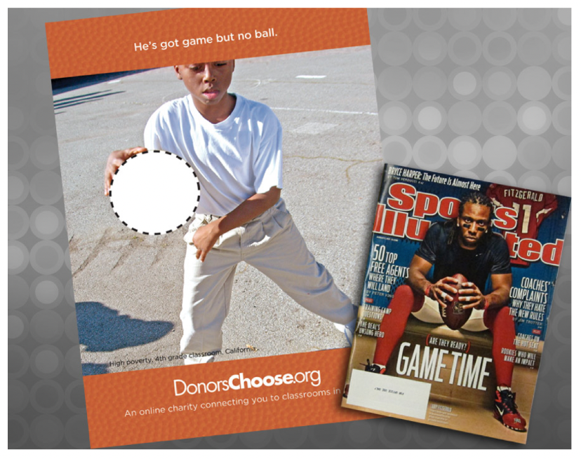
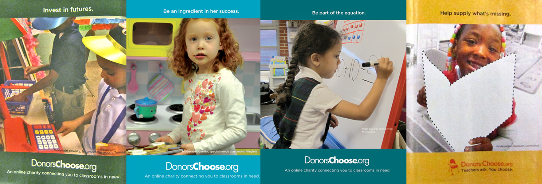
Magazines (FORTUNE, GOOD HOUSEKEEPING, TIME, NEWSWEEK in this case) would often donate pages to us if their layout got wonky. I would use real classroom photos and turn them into PSA ads that sometimes fit the “theme” of the zine. Photo editing and copy writing tailored to be quick, direct, with a pleasant hook that matched the photo.
Cover of donor thank you card for donors, utilizing actual student artwork.

Cover and inside of donor thank you card.

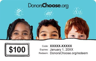
Gift cards. Early iterations leveraged tudent artwork that came through our office as part of the feedback loop in the giving experience


One of my nicer professional moments at DC.org. LinkedIn CEO Jeff Weiner was on the board of directors at DonorsChoose I had just done a bunch of redesign work on the homepage and donation flow. At a meeting Jeff asked our CEO, Charles Best: What firm did you hire to bring the emotion and personality to the site I’ve been seeing lately? Charles pointed at me and said: That guy over there in the striped shirt.