Work listed chronologically (generally)
Delight.
I count myself lucky that I’ve had jobs (one in particular) where the pursuit of delight was a frequent agenda.
I’ve gathered some samples that speak to that.
Donorschoose.org
Tremendous mission: get resources into classrooms that need them. It’s done through crowd-funding—Citizen philanthropy. They are UNSTOPPABLE. For 6 years I pitched in as head of UX/UI & Creative in general. Some people called me “Art Dept.” We didn’t really have titles. What we did have was that crucial mission that required communicating the delight of students getting much-needed materials along with the gravity of many classroom situations. I aimed to create assets (digital and analog) that spoke to this often using photos (never stock!) and student artwork that came through our office as part of the feedback loop.
Let’s rebrand!

We needed a visual shorthand for “classroom/students” that was friendly. Enter, the Eames student desk chair with shortened legs and enlarged footpads. Palette shift as well for more energy. Lobbied hard for name change but was unsuccessful. People sometimes phoned us asking about organ donation.
Getting the word out!

The simple visual mark of a student chair was a good conversation starter. Hello, elevator pitch moments. URL on back.

They do! And so do puns!
Site graphics - various

Gift card portal. Early partner, The Warb. No brick -n- mortar stores yet. Wearing some as I type this. Efforts made to re-purpose joy-inducing classroom photos with a touch of whimsy. The “Dr. Seuss Kid”, as he became to be known, was our company all-star. Made a giant, 7 ft roll-up of him for conventions of him. Such an infectious smile. We eventually reached out to him and his family with massive amount gift cards for funding on the site.

Early on, I leveraged the best student “thank you” artwork to create moments of connection for users. Metrics told us it was working. Here, an upsell during donation flow. (possibly the best student artwork I saw in the 6 years I was there. That closed eye? Are you kidding me?).
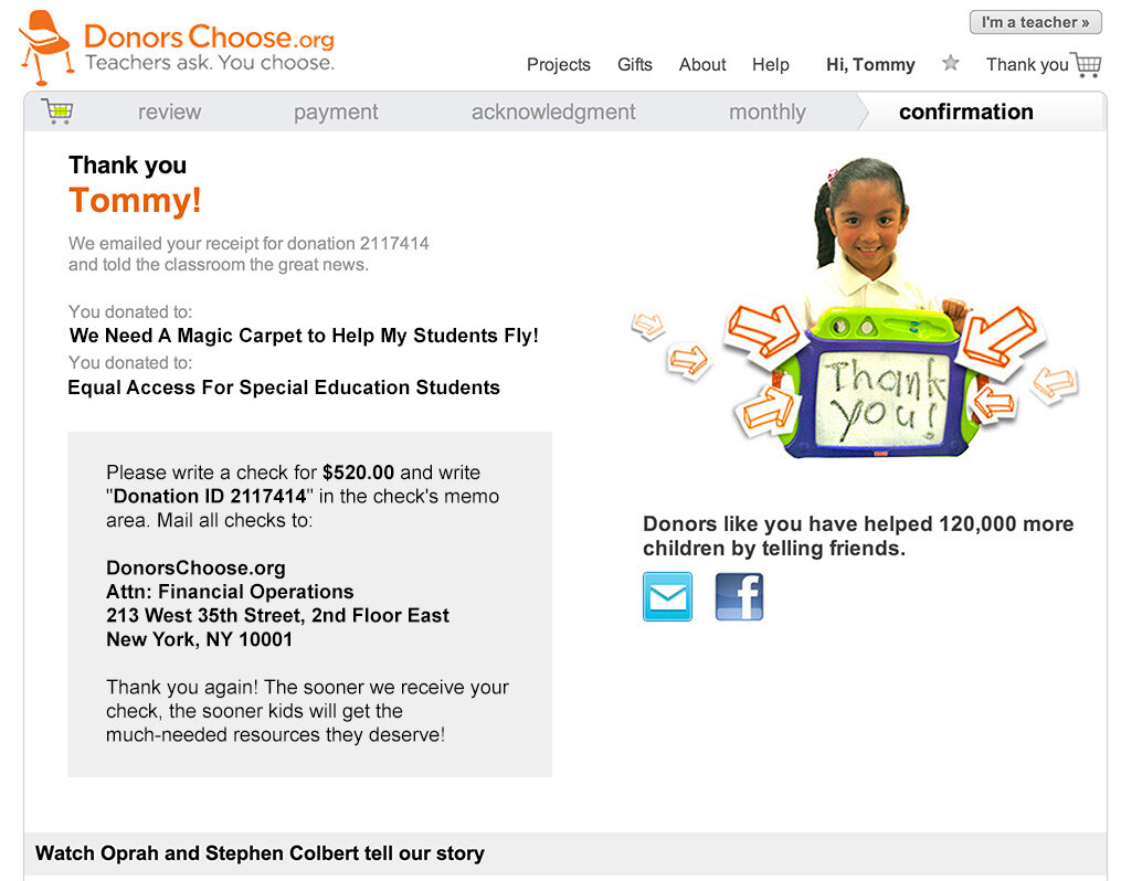
I would spend a few hours every couple of weeks scanning the most compelling student artwork of the thousands of pieces that streamed through our office as part of the donation cycle. Above is a confirmation screen, celebrating the donation with exuberant student artwork And yes, we even allowed checks as as a payment option (to fully cover older demographic).

Partner portal. Use a great photo and GET OUT OF THE WAY!

I used a school bus often as a UI element to convey movement, donation progress and fun. Here, in an interactive timeline of significant events in the org history and in earlier site iteration as a “progress marker” on timeline of a project in the donation cycle.

Memes

Memes. We called these “shareables” back in the day. Used for various things - email blasts, social posts, teacher newsletters, upsells in checkout flows. No delight on that piggy bank’s face.

We secured our first Bill & Melinda Gates Foundation grant because Melinda walked by a Colorado classroom that seemed teeming with more “life”. She asked why. The teacher said: “Donorshoose.org”
Fundraising campaign graphics
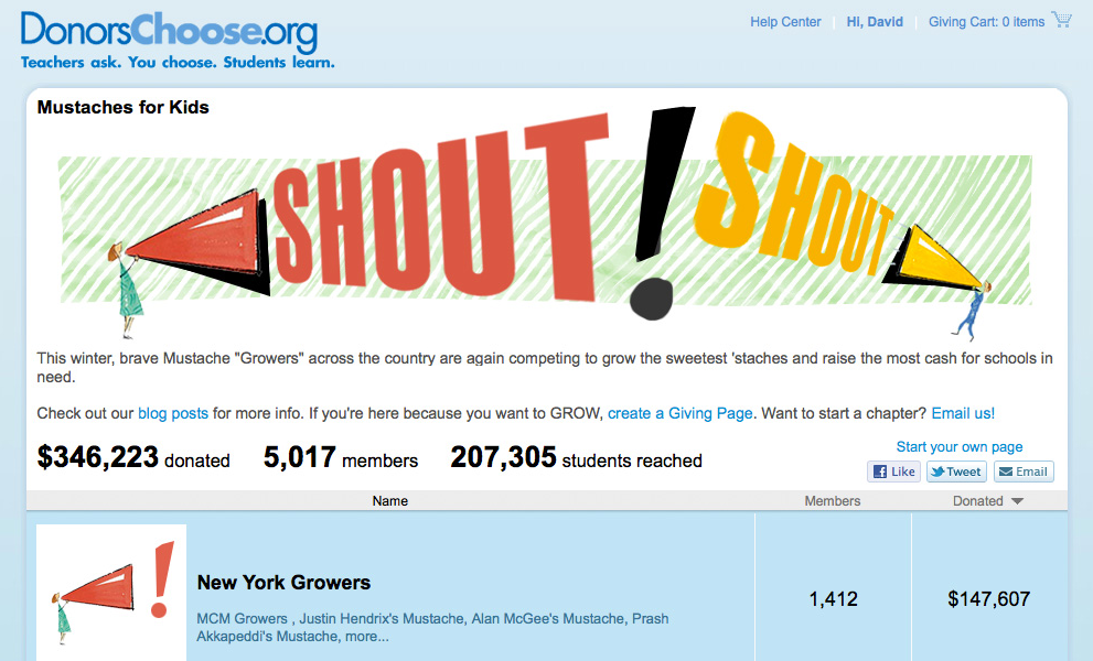
Short run campaigns, especially Mustaches for Kids, generated significant funding of school projects. I was tasked with creating site and email graphics that kicked off the efforts in a fun, engaging way.
Every October was “growing season.” We hosted a very successful fundraising campaign—MUSTACHES FOR KIDS– complete with leaderboards and grew really unflattering staches. One year I opted out and was summarily hazed and picked upon for that month. But I raised more that year than in previous. So, there!

“Dave, are you ready to make another M4K (Mustaches for Kids) banner?” Me: “Already? Ok. I am. But this year I’m going a bit edgier. Hello, Reservoir Dog Boy.”
Trying to capture the essence of a fundraising competition. I like the abstract quality of these little shouties.

Again, repurposing student artwork in constructing digital assets for campaigns.
Logo play (prior to rebrand)

Logo alteration. I would consistently do something with the "o” in “org” for campaigns. I think this was the first time colleagues I didn’t know well stopped by my desk and said: “Did you make that homepage flower logo thing?”

The version did not go live but I liked the way the hat sits on her head.

Reddit funding campaign; Hello, winter. These will not be animating anytime soon. Actually, maybe I did animate the snowflakes in the final version? But not this one.
Analog delight - print pieces

Gift cards using student artwork. A. was chosen but that bus in B. got used ALL…….THE……..TIME.

Gift Card Carrier. Celebrating our citizen philanthropists.

Donor thank you package envelope—back.

Magazines (FORTUNE, GOOD HOUSEKEEPING, TIME, NEWSWEEK in this case) would often donate pages to us if their layout got wonky. I would use real classroom photos and turn them into PSA ads that sometimes fit the “theme” of the zine. Photo editing and copy writing tailored to be quick, direct, with a pleasant hook that matched the photo.

Cover of donor thank you card. The CEO of DonorChoose was VERY BIG on using microscopes to represent classroom resources.

Cover and inside of donor thank you card. Talking logo debut.

Buckle up! Illustration used for various things.

Tote bag/poster image. I really like the slightly sad tone of this one with old school equipment. Underlying message might be: Teachers will plug away with what they have but let’s upgrade them.

In closing out this section, I’d like to reference one of my nicer moments, professionally.
LinkedIn CEO Jeff Weiner was on the board of directors at DonorsChoose (So too, Steven Colbert. Great guy). I had just done a bunch of redesign work on the homepage and donation flow. At a meeting Jeff asked our CEO, Charles Best: What firm did you hire to bring the emotion and personality to the site I’ve been seeing lately? Charles pointed at me and said: That guy over there in the striped shirt.
Jeff didn’t use the word “delight” but pretty darn close. :-)

Recent personal projects with delight as driving design principle

Illustration contest winner
Rules
Pick 1 of 4 Italian words and design a 12” x 12” (pizza box top) graphic that expresses the word. I chose “avanti”—innovation. For a month the pizza boxes at Hot Italian (so good!) had my swimmer dude. Cosponsored by local NPR radio station. Got a tour.


That time I inadvertently created a video snippet for Google’s I/O 2019
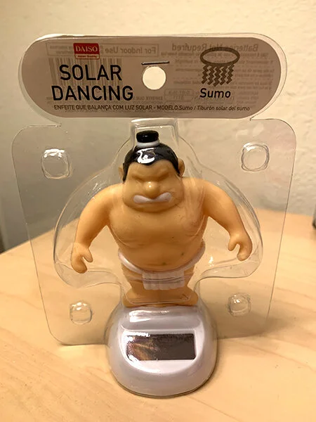
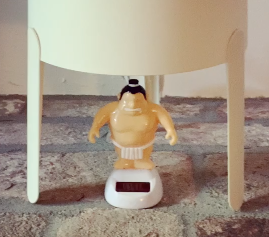
There’s a solar dancing sumo in my house that is controlled through Google mini. I posted footage of this arrangement to IG and an ad firm reached out and asked: can we buy that? Um, yes please.
“Hey Google. Hey Google. Hey Google. Hey Google. Turn on the lights. TURN…ON…SUMO. I love that.”